It could be strange to
imagine the idea of "concept" in terms of Internet browser but that is
exactly what Opera itself talks about its new browser, Neon or Opera Neon. I
downloaded and installed the application to test it and noticed that
it loads pages faster, at least it seemed much faster to load the
pages I usually access.
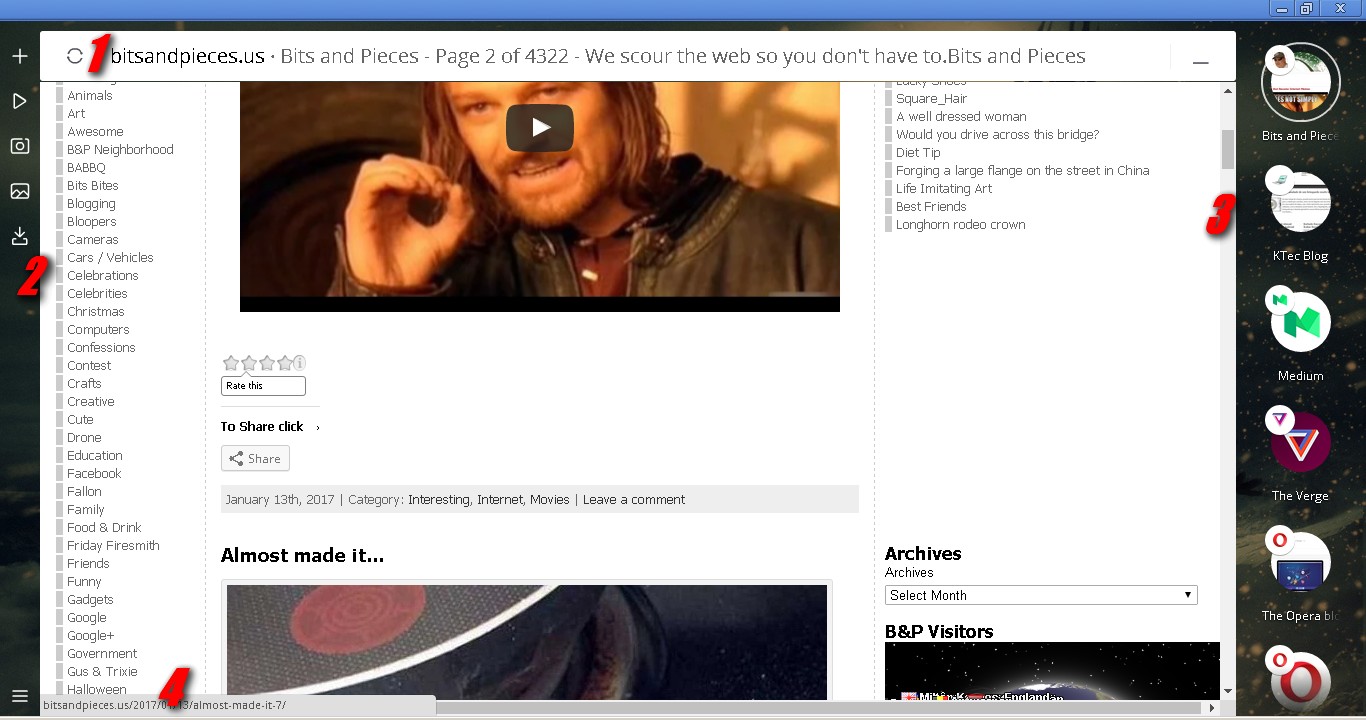
I liked the look without too much frills and the idea of using your desktop wallpaper as a browser background, but the sidebar, which is equivalent to the "open tabs" bar, is very large and consumes a lot of navigable space on the sites.
I liked the look without too much frills and the idea of using your desktop wallpaper as a browser background, but the sidebar, which is equivalent to the "open tabs" bar, is very large and consumes a lot of navigable space on the sites.
I have not yet figured out a way to close or hide this sidebar to widen the window space. In addition, the "alt+tab" key combination does not show the open tabs, it simply switches between them and in fact, in this new browser they are not tabs but "bubbles", which is already part of the concept idea but, they could be shown in a floating set of small bubbles that, when accessed, would open showing the options and thus save space on the navigable window once more.
On the other side of the window, the browser displays a bar that functions as the browser's "menu bar" but, like the previous one, this one consumes some space in the browseable area and could also be summarized in a small icon or a small floating bar.
The
status bar follows the recent pattern of most browsers, which greatly
bothers "old times" internet users like me, because
sometimes we use the showed info in this bar to get important
data before accessing a dubious or unknown link but, this new standard adopted by recent browsers is very short and shows less informations. For those who like to save space for navigation this is good but, on
the other hand, the space used by an expanded status bar is minimal and the level of information provided by it is very useful.
What is the navigable window space?
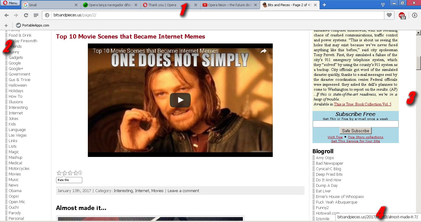
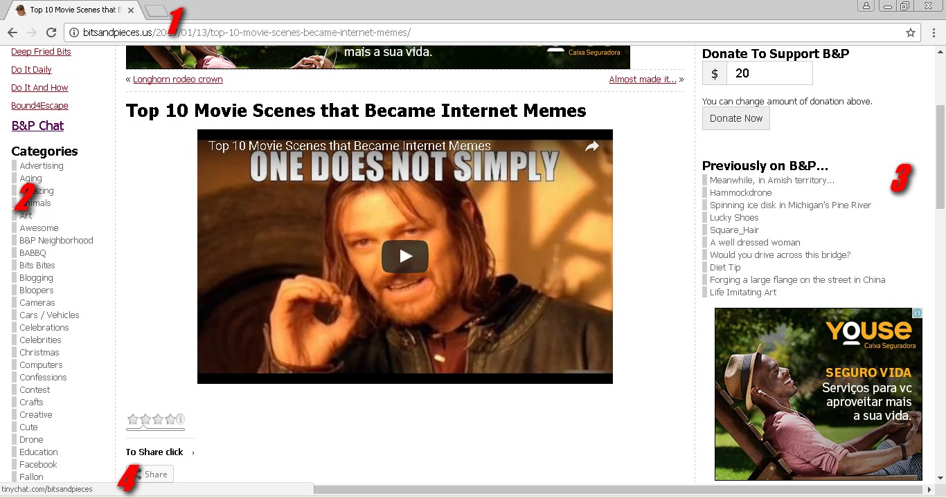
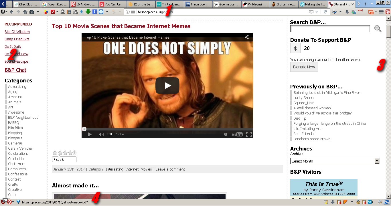
You see, when you surf the internet, depending on the resolution of your screen, you can get a lot of space for the navigation itself. I ran a test with the most popular browsers, including Neon, to show and explain it. This test was run on my personal notebook that has the screen resolution of 1366 x 768, see the practical examples of this in the following images.
Opera Neon
Click to enlarge
- Address Bar
- One side of the browser window filled with the menu of this browser
- Another side of the browser windows filled with the bubblesof opened sites
- The small status bar
Opera
Click to enlarge
- Address and tabs bar
- One side of the browser window filled with the content of the web site
- Another side of the browser windows, also filled with the content of the web site
- The small status bar
Chrome
Click to enlarge
- Address and tabs bar
- One side of the browser window filled with the content of the web site
- Another side of the browser windows, also filled with the content of the web site
- The small status bar
Firefox
Click to enlarge
- Address and tabs
- One side of the browser window filled with the content of the web site
- Another side of the browser windows, also filled with the content of the web site
- The expanded status bar that could show more info about links
Palemoon
Click to enlarge
- Address and tabs bar (which is the narrowest or thinest that I get)
- One side of the browser window filled with the content of the web site
- Another side of the browser windows, also filled with the content of the web site
- The expanded status bar that could show more info about link
I need to be clear about the fact that in the cases of Firefox and Palemoon I did just that and they are not in their default format. I always use some addons in them that change their appearance and functionality by making browsers thinner and making as much space as possible to show the content of the sites, which is what interests me the most.
It is obvious that the same level of configuration can be achieved in Opera (maybe) and Chrome but, as a matter of preference, I always opt for Firefox or Palemoon.
So, is it worth it or not ?
Do not change your preferred browser yet! Many
years ago, when the internet was practicing its first steps and the
browser market was in hot in the "Browsers war", my
favorite browser was the Opera. Over the years, I've been identifying more with Firefox and Palemoon, which are my favorite browsers nowadays.
Opera Neon seems to be very good, has interesting points in the look and the loading speed of the pages really impresses me but, it is not yet mature enough to replace your favorite browser, you can be sure of that.
Of course, it's worth installing to test and get to know the idea, but nothing more.
*** I kindly ask you all to forgive my poor grammar and spell errors because, I'm a self taught on English and, I don't like to use google or any other online translator. I like to commit this errors and love when someone sincerely point this to me. It helps me a lot. So, feel free to enjoy this article and to corrects me ;)


0 Comentários:
Postar um comentário
A T E N Ç Ã O ! ! ! Todos os comentários são bem vindos. Porém, comentários com palavrões ou citações que sejam consideradas ofensivas serão sumariamente deletados.
Tks.